Tuesday, 21 October 2014

Anselm Kiefer with AttRAct at The RA

AttRAct Anselm Kiefer workshop - Caroline Wong
Anselm Kiefer inspired painting - Caroline Wong
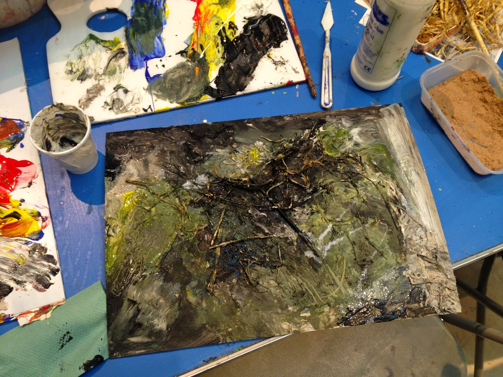
Today I attended an AttRAct workshop on Anselm Kiefer at the Royal Academy of Arts. I was able to participate in the general discussion about the artwork prior to entering the exhibition and then went on to present my favourite piece post viewing. After this, I was encouraged to create a Kiefer inspired painting using numerous different painting mediums.


Kiefer's early work is my favourite. A lot of it is political and his paintings often reference Norse mythology and religion. As he was 'born in the rubble' of World War 2, a lot of his artwork looks into Germany prior to Nazi power and was often seen as scandalous. It wasn't until he moved to France that he began to garner interest in his work. In Germany, his work talked about the many taboos that had really only become taboos because of their association with Hitler. One famous example is that of a battle the Germans won against the Romans. Hitler however used this example of Germany beating a powerful army in his speeches and when Nazi power collapsed, referencing the Roman battle became something no one could do. Kiefer looks into returning power to Germany by looking past their Nazi period and revelling in their other successes. However, his approach can come across as a little 'in your face' and I guess it is because of this misunderstanding that his work never took off in his home country. There's a lot of imagery used in Kiefer's work and spending an hour in the exhibit was not nearly enough time to really get a look at the paintings. Each painting appeared to have more to it that it seemed. A lot of them told stories, or illicit curiosity. 

The workshop resulted in creating a Kiefer inspired painting where we used numerous mediums ranging from paint to PVA to sand and dirt. It felt nice to let loose and experiment as we were given the choice on whether or not to reference a selection of photographs. I chose not to, and am glad I didn't. The resulting piece I created is the creation of my own emotions at the time- light greens for a brightness, dark greens for the longing to go to the countryside and black and grey for an inner turmoil.


Monday, 20 October 2014

STRUCTURAL ATTACHMENT PROJECT FINAL OVERVIEW

This project as a whole has been eventful which is why I've felt the need to sum up all my thoughts in a post starting from the beginning of this project to the end.

My starting point for this project has always been psychological attachment. I am always interested in the human mind and psychology and my A-Levels were in Art, Biology and Psychology. The topic of psychological attachment seemed like the best way to marry my interests. My starting point for the word 'structure' came from everything that is the opposite to the usual connotations it has. Usually, structure makes one think of large robust buildings, heavy metals etc, but I wanted to look at it in a lighter light (pardon the awful pun) and decided I'd focus on fragility and dainty structures.

I first looked into my friendships. The art foundation had been underway for a few weeks and I still didn't have a proper idea in my head. I knew I wanted to do psychological attachment but the spectrum was too wide and I had no idea what I wanted to do within that realm. My friends were all started to slowly move out of London and I had a two week period of tension headaches due to the stress of it all. Personally, I am someone that relies heavily on my friends as they're my support network and when I went to the hospital fearing a brain tumour after a week of violent head pain, I was told it was probably due to my subconscious dread that my friends were moving away. With that knowledge, the headaches only began to subside one week later and my medication was 'Calpol, lots of water and fun times with friends'.

My best friend called me one day that week to ask how I was and it was then that I decided I would look into relationships between people as my field of psychological attachment. Since friends were on my mind so much, it made sense to look into the emotions that come with attachments. For example, babies often cry when their mothers leave the room and this is because they're psychologically attached to them. In the same way, I was feeling low because my friends had all moved away.

The two themes merged into one when I began looking at twins as a step up from friendships. I've known a few pairs of twins and they always seem like the best of friends. They typically live together, have the same friendship group and can even be identical to each other. Furthermore they were born from the same sperm and egg. This idea of birth fit in with my idea of fragile structures and this is when my headpiece designs took off in an alien/embryo/amniotic-sac-esque way. My inclusion of this headpiece in a final piece would incorporate 'structural' accessories into a very 'attachment' focused concept.

Another tangent off of twins was to look at Dr Seuss' characters Thing One and Thing Two. No one knows exactly what kind of creatures they are but they could be friends or twins, who knows? To tie in with my structural concept, I created simple headpieces out of thin wire resulting in a big 'One' and 'Two' for my models to wear. This would capture the essence of Thing One and Two which was derived and inspired by best friends/twins whilst also maintaining a stance on being a dainty structure.

Moving on into applying these concepts, my editorial looked into my original feelings of missing friendships. The emotions felt and portrayed in the photos are supposed to mimic that of an ending friendship (read: psychological attachment) and so the expressions shown by the models aren't happy but more subdued and sad. With the film however, it is the opposite. I wanted to explore the realms of psychological attachments and their implications on our emotions to the full extent and so I looked into how I would portray the happiness that comes with relationships and friendships.

As a whole, I have learnt a great deal through this project about myself, about the industry and about the subject in general. I've learnt how to take an idea, turn it into a concept and finally take it through to realisation. I've learnt how necessary it is to conduct thorough research and I've felt proud being able to use my own knowledge to help others. Watching my project and everyone else's projects bloom from the beginning stages into great final pieces has been the greatest reward for me along with the knowledge and skills I've picked up along the way.

Saturday, 18 October 2014

STRUCTURAL ATTACHMENT FASHION FILM


I have aptly named the final film 'Troublemakers'. It was awfully hard coming up with a name but I think that Troublemakers sums up the concept pretty well. I am probably 90% happy with my film and would add the extra 10% had some of the shots been sturdier through using a tripod. However, I am extremely pleased with the way I edited the film.

The focus on the scarf isn't too pushy which I guess can be seen as both a plus and a minus for an advert campaign. It's not 'in your face' which consumers will like but I can't say how well the film sells the product. The final film is also more tailored to children's wear and I think this is due to the playfulness of the footage so I don't mind. As this was the concept I was looking for, I am glad it turned out this way. I think that if I were to use children in an advert for womenswear, it would definitely have to be serious and demure (like Karen Walker's sunglasses campaign).

The Youtube description is as follows:

'Troublemakers' is a fashion film responding to the title, 'Structural Attachment'. It focuses on the fun side a psychological attachment has by showing the playfulness between two twins. 

Styling/Film: Caroline Wong 
Model: Marlene Ko 
Clothing: unbranded (from Copenhagen), Disney store
Scarf: Stylist's own, handmade
Headpiece: Stylist's own


With the film focusing on psychological 'attachment', the elements of 'structure' are small. In order to incorporate 'structure', my model wore the crown headpiece I'd made for a small section of the film right at the beginning. The headpiece was inspired by fragile structures such as embryos and amniotic sacs and this was my way of incorporating the two words into one film.

Friday, 17 October 2014

SA PROJECT UPDATE 12 (editing process)

Editing on Adobe Premiere Pro CC 2014 - Caroline Wong 
Editing on iMovie - Caroline Wong
To edit my movie, I used iMovie and Adobe Premiere Pro. The reason for using both is because I like that on iMovie, you can see the clip you are working on whereas on Premiere Pro, clips come up on the timeline as blocks and nothing else. Premiere Pro however is more professional and as I needed to crop the frames of clips, iMovie wasn't able to offer this function. This resulted in me using Premiere Pro to create the framed clips before importing everything into iMovie and creating the final film there.

During the film workshop, I learnt how to create composite clips where more than one clip plays on the screen at the same time whilst showing everything. I also learnt (through a mistake made when filming our fashion film) how to go about fixing clips that didn't quite fit together through zooming in and out to adjust the perspective. All of these skills acquired came in handy when editing as I used 4, 8 and 16 point garbage matte's on all the clips being cropped into different shaped frames. For the clips that didn't quite line up, I was able to use my previous knowledge on how to solve the problem and managed to save those shots (example shown above in Premiere Pro screenshot). All composite shots and framed shots were mounted on a white background as I was referring to my previous research into one of my favorite fashion films 'Hurricane Irene' by Jminism.

Editing took the longest amount of time as I was using a remix of Stevie Wonder's superstition as my backing track. In order to get the editing perfect, I had to ensure clips changed at every beat drop (which happened more often than not). The resulting film is very fast paced and as you can see above in the iMovie screenshot, a lot of the clips were sped up to either ensure that the entire thing could be shown (as I was unwilling to cut out a few things) or to match the feel of the film.

On iMovie, I was also able to play around with the white balance, exposure and contrast that I had made a note to do when storyboarding and experimenting with my shots. Because we had filmed inside without any proper lighting equipment, the white walls appeared to be rather yellow on camera despite adjusting the white balance on my camera. By further adjusting the white balance on iMovie, I was able to get the shots to seamlessly go from white wall to white background on the framed shots.


Thursday, 16 October 2014

SA PROJECT UPDATE 11 (storyboard)

Fashion film storyboarding - Caroline Wong
As I was unsure of how filming would go and what shots I would get in the end given the fact that I was working with an overly sugar-loaded 3 year old, I created my storyboard and experimented with the shots I got after filming all the footage. Again, I couldn't create an accurate storyboard of events as the music I've chosen is very fast and it is therefore impossible to create a sequence without making a lot of mistakes given timing and clip lengths. To create a sequence would have been a waste of my time and so I worked around this problem, instead choosing clips I definitely wanted to include, cutting the frames down to how I would want them in the film and piecing together a few clips that work together so that I would remember their relationship.

Above you can see where I have decided I will split the clips. I like the way different frames in a music video can look (see here for an example) especially when they change in time to the music. The resulting film is snappy and makes you want to re-watch. As I am thinking of this film as a television advert, the want to re-watch is very important and the film needs to be memorable so that viewers decide to head out and purchase the product.


Wednesday, 15 October 2014

SA PROJECT UPDATE 11 (creating a product)

Product research - Caroline Wong
With the mindset that my fashion film was now an advert and therefore a marketing technique, I looked into what 'product' I should be selling. By looking back at the AW14 catwalks, a standout accessory at the shows were large or long and oversized scarves (seen at House of Holland, Acne, Christian Dior etc). 

As I know how to hand knit, I thought I would make the scarf to be used in the film because I thought it would help me really visualise the film as an advert selling a product I've made. It took me just under 3 days to complete and I wanted it to be so oversized that it would drown my 3 year old model. The scarf was made of blue wool that had varying colors in it, channelling Acne's blue designs (pictured above) whilst also sticking to my blue monochrome color. In the film, my model will only wear blue dresses and props will also only be blue.


Tuesday, 14 October 2014

SA PROJECT UPDATE 9 (Fashion film concept board)

Fashion film concept board - Caroline Wong

As mentioned before, the concept for the film is to act as the opposite to the editorial. The editorial looked into emotions in psychological attachments such as those felt when friendships temporarily break up. This was influenced by my current situation where my friends have moved away from home to go to university out of London. However, as the film is looking into the positives of a psychological attachment, I've collected images and fashion film stills that sum up what I want my final outcome to be like.

The story of the film are a pair of twins (played by my cousin) who play practical jokes on each other and are generally just playful characters. To do this, I will be editing my footage in such a way that it will seem as though there are two of my cousin. As shown above, I want to use numerous split screens because it's a way to make a film more interesting and vibrant. 

Karen Walker used children for her Forever 2nd Summer 2013 advert campaign and the images have been a constant reference point in my research. Whilst it would have been fitting to use sunglasses in my fashion film, I will be using a winter accessory as the film is supposed to be tailored for A/W. At the moment, I am thinking of creating an accessory myself and as my film's concept is somewhat inspired by Karen Walker's campaign, I am going to use this fashion film as an advert for a knitwear brand. I want the film to look as if it could be televised and used as a clothing advert, either for kids or for womenswear.