Monday, 29 September 2014

29/09/14 - Creating Accessory Samples

Plastic cup sample - Caroline Wong 29/09/14
Bobby pin sample - Caroline Wong 29/09/14
For the three objects we were asked to bring in and work with, I brought in plastic cups, bobby pins and a selection of new and fully used tealights. Whilst making samples, I found that the pieces I liked most were those that incorporated the use of my plastic cups and hot glue. Together, they created something textured and whimsical that I think amniotic fluid would look like. The samples I made look like some sort of solidified alien fluid (technical term) and as I've been looking into twins and birth as a tangent, these plastic pieces tied in nicely. 

The pieces we made had to be scanned in and blown up and this is where I believe I had the most trouble. I really liked the 3D structure I'd made with the bobby pins but it proved to be awful to photocopy. Because of this, I had to abandon the sample for the rest of the workshop and instead I only focused on my weird and strange embryo-esque pieces.

Experimenting with scans - Caroline Wong 29/09/14
This workshop was enjoyable as I like creating 3D pieces and making things (all of my A-level final pieces were sculptural). I especially like working with tools though I'm not entirely sure why and it felt good to wield the glue gun and get down to making. The workshop also forced me to think more about incorporating accessories into shoots. 


As I'm a promotion student, I am producing a photoshoot and a film and I've begun thinking about creating an accessory for both shoots. The accessory I want to create for the photoshoot will tie in with my ideas of psychological attachment and the characters 'thing one' and 'thing two' as mentioned before. The work I produce in the workshops will be inspired by the amniotic fluid and other 'alien' substances that come into play during childbirth. 

What I plan on doing next is experimenting with other materials to create grotesque structures that I can use in conjunction with the molten plastic pieces to create my headpiece. As I already know that my model for the shoot is going to be my cousin (who's only 3 years old), I want to keep the design fun to not only show the happiness attachment can bring as a flip to the photoshoot (which is going to highlight the pain of an attachment) and I intend on bringing in 'structure' through the use of references to amniotic fluid etc. This ties in with the delicacy and fragility of 'structures' that I was originally so interested in.


Sunday, 28 September 2014

SA PROJECT UPDATE 2

Second concept board - Caroline Wong
As I am required to create accessories for my shoot, I decided to keep looking into other inspirations surrounding duos. One such duo that have particularly caught my eye are Thing One and Thing Two from Dr Seuss' "The Cat in The Hat". For this project, I am going to produce an editorial and a fashion film/advertisement and Thing One and Thing Two have qualities that I wish to incorporate into both pieces of work. For the editorial, I studied they way Thing One and Thing Two had been illustrated by Seuss and I liked the fact that their names were the only defining feature of their red morphsuit-like body. It is this slogan that I want to incorporate into my shoot and I plan on making them into headpieces so as to not deter away from the outfits and expressions of the models. 

The aspect of Thing One and Thing Two that I am using for the fashion film is their playfulness. In the book, Seuss portrays them to be troublemakers and comical characters, sometimes even childish. As my editorial highlights the sadness a psychological attachment can bring, I want my film to do the opposite- focus on the positive and fun of a psychological attachment.

As my starting point for my editorial was to look at my best friend and her impact on me, I looked into my family as the starting point for my film. I have a number of photos of my cousins and I when we were younger where I realised we all dressed alike and looked alike to some extent. This however isn't the case anymore. I now have a younger cousin who was born a good few years after most of us and she's currently 3 years old. In all our family photos, none of us look alike nor dress alike as we're all older and we're all our own people now. We have the ability to make our own decisions about the way we look and thus, we don't look the same as our parents aren't able to bounce off of each other for infant styling advice. My cousin, I feel, is missing out in a way. There will never be a photo where we all laugh because everyone one of the 5 eldest cousins is rocking the same hideous bowl haircut that our grandma gave us.

Cousins and I all dressed similarly (2002) - Caroline Wong


The youngest cousin, Marlene Ko - Ina Ko (October 2014)
This led me to think a bit more about what I'd realised. Sure, my cousin didn't have photos where she'd appear to be similar to us in the way twins are similar to each other but so what? I still wasn't sure how I was going to relate this to a shoot or film.

Instead of thinking too much about it, I noted the thoughts down on my phone and took off to Central London as I like walking around on my own as it starts to get dark since it helps me think. I brought my sketchbook with me and, whilst on the tube, flicked through to my initial brainstorm of ideas. One of my trains of thought had been to use my family members as models- this itself would show family relationships and psychological attachments. 

I took myself off to a Costa Coffee and began looking into one of my other inspirations- twins, be it paternal, fraternal or Siamese. In my mind, I see twins to have an incredible bond with each other. Not only do they usually live together but a lot of the times, they are brought up in exactly the same way, eating the same food, attending the same school, having the same teachers and lifestyle and being dressed in the same way too by their parents. It is not just their DNA that twins share identical versions of. Siamese twins too also share a literal attachment to each other and what I've taken from looking into twins in general is the idea of having two, or 'seeing double'. This is an aspect that will feature in both the shoot and film I produce.

As mentioned before, I will be using two models for my photo shoot and I plan on using split screens and other means to show my cousin in a double act.


SA PROJECT UPDATE 1

First concept board - Caroline Wong
After my meeting with Becca, I realised that I hadn't been focusing hard enough on the actual project at hand. The hypothetical kick up the backside pushed me to pick up where I'd left off/ never really started and I began thinking about ways to portray psychological attachment since this is what I've been most interested in since the beginning.

My initial thoughts took me to my friends and family and a phone call from my best friend who's now living in Bristol for university led me to head to the study zone and pull out the September 1995 issue of Vogue and the February 1996 issue of Elle. These are the months that my best friend and I were born in and I thought it'd be helpful to explore this period especially as I still wasn't sure how I was going to go about this project. With no idea where I was headed, I thought this would be a way to actively seek direction.

Looking through the magazines led me to the Kenzo 1995 advert and Dolce & Gabbana 1996 advert. The Kenzo advert showed a number of models lying down holding hands, dressed in bright but minimalistic clothing and I liked the styling of the shoot as it's similar to my own sense of style. The D&G advert showed two female models embracing each other and I took them to be friends, perhaps even best friends. This led to something of an epiphany moment when I was back on my way home- I wanted to use two models in my shoot in order to show psychological attachment.

When I got home, I began looking into famous female duos- the most intriguing being Thelma and Louise from the 1991 film named after them. Whilst they are fictional best friends, the film highlighted their friendship and bond with each other and the way they protected and cared for each other struck a chord with me. What was most attractive about the film was the ending- the viewer is led to decide whether or not they want the ending to be happy (where the women escape the police and live) or sad (where the women drive on and plummet to their deaths). In my case, I found that I was most excited by the latter. The poignant end to their lives whilst the car drives off the cliff into the air connotes something of a 'friendship lasts forever' scenario. Through looking at Thelma and Louise, the basis for my models' poses and expressions for the shoot have begun to develop.


26/09/14 - Fashion Film


Above is the final 60 second version of our fashion film which draws inspiration from tragic heroines- Juliet, Ophelia and Ariadne. To pay homage to the story of the Minotaur, the camera runs after the character in the film who flees, desperate to find her lover, desperate to escape her guilt. (Our full version film is below).

My thoughts on this film are varied. Whilst I loved making it and filming it, I'm not 100% happy with the final outcome and I'm not sure why. I'm extremely proud of our 'three person shot' and I now know I can recreate this in Adobe Premiere Pro but I'm not entirely in love with some of the shots. As we were going for an ominous feeling, we agreed on shooting a shaky 'running after the model' shot but now that I look back, I would have changed this shot to a smooth swoop. This would of course be impossible without specialist filming equipment to stabilise the camera but I think this would give the impression of urgency whilst upholding a level of professionalism. As the camera swoops in and pans across the scene, we'd see the model running, looking behind her in fear. Since our vision doesn't shake when we run and we can still focus on what is in front of us without the image jumping up and down as we do, this would give the illusion that the camera is the eyes of the person pursuing the model, rather than the shot looking as though the pursuer has a camera taped to their forehead.

I'd definitely like to create another film, this time maybe stepping away from formalwear. It'd be interested to shoot an accessory advert of some sort and I am definitely researching ideas and looking into how I can make a fashion film that's even better than this one.


Thursday, 25 September 2014

24/09/14 - Editing our Fashion Film


Editing was quite quick despite our problems. We first decided to watch through all the footage we had which turned out to run for almost three minutes- far more than the 60 seconds we had to captivate our audience. After looking at every shot we'd taken, we decided it would be a good idea to first narrow the clips down into what was usable to create a long version of what our one minute film would be. This longer film lasted 1 minute 34 seconds. Through the gruelling process of cutting down on shots that we reasoned weren't strong enough to make the one minute cut, our final film is 55 seconds long.

Whilst the screenshot above shows iMovie, we did some of the editing on Adobe Premiere Pro. The clip above depicts a scene where there are three of the same person and this was done on Premiere Pro through the help and guidance of our tutor. To create this effect, a 4 point mask was added onto the layers and the frames were then cropped to only reveal what was needed. Our major problem however was that for the final take we shot (the cream dress on the right), we'd forgotten to zoom out of the camera after taking a few close up shots of Loredana. Whilst the tripod had stayed in the same place, we'd lost the perspective due to the zooming in and this made the post-production editing a little harder. To combat it though, we simply resized the clip to make the frame itself smaller (or 'un-zoomed', if you'd like) and slotted it into where it should have been on the base clip.

Realising this mistake, I believe what would have been better was to plan more. Whilst we made an effort to storyboard and think out different shots, it's inevitable that problems will occur without sufficient planning. Since we'd only had Monday to plan, I think that I could produce work with half as many problems in it had I had a few more days to think. Other than this, working in a group was a fun way to explore other people's ideas. It was good and eye-opening to see what my group members' interests were and working closely as a team made us able to become closer to each other. As we've only known each other a matter of weeks, there's nothing like scaling walls together and squeezing you into your prom dress to bring you closer.

Tuesday, 23 September 2014

23/09/14 - Vogue FNO


It's now my third year going down to Central London for Vogue Fashion's Night Out and whilst this time I didn't manage to get in on the events in time, I still enjoyed wandering around anyway. As it was a fashion event tonight, there were far more people dressed up than usual. Since I'm pretty much always spending my time in and around Central London (be it for the RA, Soho or Chinatown), it was nice to see the contrast tonight.

Whilst being showered with freebies and prizes is lovely, I found myself looking at the people attending. I didn't manage to get any photographs of people who caught my eye which is regretful but I still remember the guy dressed in all black sporting a mushroom haircut who simply oozed charisma. There were those dressed in a more fun way too- someone wore a Pokemon Poliwrath rucksack with a hot pink denim shirt whilst another wore a gold sweater which left me seriously wondering just how on earth he was still managing to cope in the hot and stuffy stores without breaking a sweat.

Even if I wasn't able to take anything away from FNO for the project, it was an opportunity to take in inspiration from my surroundings to go towards my own personal style.  I was also able to look around the stores and see what's in and what other people were most interested in purchasing and that, I feel, is very valuable information.


23/09/14 - Shooting our Fashion Film


It's around 12.30pm and we've reached our location, the secret garden in Golders Hill Park- Pergola and Hill Garden. Filming with Loredana as our model starts and everyone takes on their roles. I'm directing and filming, Christele styles and helps guide some shots and Loredana models whilst also bringing her own style to the table. I think we made a great team.

Since we hadn't been able to come beforehand to properly scout the location, we started off by first walking around the garden and getting a feel for the place. The lighting was great and there were little to no people around with us. I took some shots of the different filming spots to look over whilst Loredana got changed and then we began filming.

We began by following the storyboard which proved to be very useful. There were lots of dress changes which couldn't be avoided as the camera (or rather the tripod) had to be positioned in the same place for a few shots. Because of this, Loredana was constantly getting in and out of different ball gowns, changing over her earrings and necklaces and bracelets all the time. This would be one criticism of today's work- it would have been better had we had more cameras and tripods to ensure continuity in every shot without having to get changed after each small clip had been filmed. 

Every now and then, we had new ideas and so we decided we'd film those ideas as well, even though they weren't on our storyboards. We figured that since we had come up with them, we may as well get the footage then decide to cut it or use it to replace an original idea that wasn't as good. 

Filming is always enjoyable for me but it was even more so today as I could see our vision for the film unfolding before my very own eyes. I know I must have looked ridiculous scaling the walls and running after Loredana, arms outstretched, knees bent, back hunched over, but judging from the clips we got, I believe everything was worth it. 


Monday, 22 September 2014

22/09/14 - Introduction to Film Making

Today's work involved getting to know Adobe Premier Pro and beginning to work on our own fashion films. Since I frequently make video diaries of my holidays, I'm probably overly excited about this week's project. I've also made a fashion film before with my friend who is now studying Film Production. The only difference now is that this week's final product will be a one minute short, shot by myself, and planned with Loredana and Christele who are in my group.

Adobe Premier Pro is unfamiliar to me as I'm used to working with Windows Movie Maker, Serif and iMovie. However, since I've been able to pick up each of the three programs relatively well, I didn't think I struggled much in being able to edit the clips we test shot around Ravensbourne as a means of getting a feel for the program.

Originally we wanted to shoot a story highlighting the trouble brides-to-be go through when finding that perfect dress. Our only drawback was that no wedding dress shop would allow us to come in and film under such short notice. Loredana is interested mainly in wedding dress design and so we thought it best to nurture this and instead decided to film a short without a plot, showcasing long floaty gowns- perfect from a formal night.

The girl in the film is inspired by Juliet and Ophelia, two Shakespearean women who both suffer from tragedy and come to rather tragic ends. Ophelia commits suicide, drowning herself in a lake through the grief for her murdered father and Juliet kills herself over the belief that her beloved Romeo is dead. Further inspiration came from Yoann Lemoine's fashion film for the perfume, Lolita Lempicka as we found ourselves enjoying watching it whilst also feeling slightly uneasy for the duration. There was this eery creepiness that we loved and we really wanted to bring this element into our own work.

It would have been nice to do more research but as our aim is to be editing on Wednesday, we took what inspiration and research we had and began looking into locations. We wanted a classical garden of some sort, somewhere that is beautiful but when empty can also give an ominous appeal to it. I remembered seeing some photographs that an older student a few years above me had taken back when I was in GCSE level and when I looked around on Facebook, I noticed a classmate had also taken some photographs in the same location over the summer. All it took was a quick message to her and we were then equipped with the location's name (Pergola and Hill Gardens, Hampstead Heath) along with instructions on how to reach the secret garden.

Christele looked into music and we've provisionally decided on using the OST (official soundtrack) from The Good Wife (Season 5). We wanted something that would evoke a sense of urgency as we've planned to film lots of running shots and the OST sounds like a winner for the moment.

We also managed to storyboard the entire film basing our shots off of my friend's photographs. Whilst it isn't ideal and it's definitely a drawback, we didn't want to be faffing about when it came to filming and so storyboarding seemed like the right thing to do (storyboarding is also another thing my film production friend drilled into me after sternly telling me, 'no, we cannot go with the flow'). If we had had more time, it would have definitely been helpful and more professional to take some test location shots as then our storyboarding would have been much more thorough.

Once the storyboarding was done and we had decided what music we'd use, what feel we were going for and where the film was going to be shot, all that was left was to check the weather. No rain = all okay.

This film relates to the title 'Structural Attachment' through the emotions we're going to try and portray. Our character, or muse, will embody Juliet and Ophelia as she runs through the column-lined pergola. She's frightened, scared, and is being chased- perhaps by someone or something. It could be the ghosts of those that they love and this will show their psychological attachment. The location itself symbolises structure through the countless columns, numerous overhead wooden beams and stone stairs and bridges. As one area of 'structure' that I'm interested in is the juxtaposition of malleable and flimsy structure as opposed to robust and hard structure, the contrast between the stone architecture and the soft, almost whimsical movement of the dresses is very interesting to me and it's my aim to capture this on film.


Sunday, 21 September 2014

20/09/14 - Meet Sora

This week has been difficult and I've struggled to post every day. Having workshops and tutor time everyday made it a whole lot harder to battle the ongoing headache that's left me wondering whether or not I have a brain tumour (and believe me, I'm not one to generally freak out over such matters). Either way, besides the constant drumming in my head and the need to drug up on the paracetemol, this week has been the most enjoyable so far as life drawing is something I love, and the promotion workshops have been quite possibly the funnest things ever.

On Friday, we were asked to present our muses and I felt like everyone did a really good job of getting their point across. Mine was originally called Holly, but I've since changed the name to Sora- a play on the word 'soar' for 'soaring for goals and into the sky'.

6AM wake up, checking e-mails from fellow doctors.
Bathtub reading, broadening her horizons and knowledge. Constantly working to cure her patients.
Drunk and able to have fun. Letting go of life's daily stresses.
Sora is a psychiatrist, dedicated to helping her patients regain their mental health. She's a sassy, straight talking and self-proclaimed first class bitch at work but deep down, she's fragile and delicate. She's constantly working hard, answering emails, reading books and articles and studies in psychology to better her knowledge and help her become the best she can be for the welfare of others. Growing up, she only ever thought about becoming a doctor and excelling in her studies but as the years have gone on (and now that her job is stable and she understands where she is in society), she's begun to slowly move out of her shell. She's dyed her naturally brown hair blonde and she feels that this is perhaps one of the few ways she can prove she isn't just this uptight workaholic. These characteristics of Sora were all inspired by the fictional character of Ji Hae Soo.

If she were to be a lipstick, she would be called 'chappy birthday'- a limited edition Chapstick. I chose this because I thought Sora would be a little boring and 'vanilla' as it were, much like a Chapstick which doesn't add color to your lips, only a bit of moisture. However, Chapsticks are essential and Sora would be this essential addition into one's life- be it for her patients, her colleagues, or her friends. The 'Chappy Birthday' chapstick would also be clear in color, with added multi-color sprinkles in the stick itself. I thought this would be best to symbolise Sora's bubbly and vivacious nature when it comes to her friendships (and also when her juniors have managed to get her drunk at company dinners). These characteristics came from my contemporary inspiration, Lee Sung Kyung.

She wouldn't sing anything at the karaoke sober. Only if she were completely inebriated would she willingly stand up and belt out a few tunes. Such tunes I can see Sora singing include: Baby by Justin Bieber, Call Me Maybe by Carly Rae Jepson and anything by Taylor Swift. All the awful songs she swears she hates? She will sing those.

Sora also believes she doesn't have time for men- being a doctor and all. She thinks she'd most suit a business man who would also be just as busy as her and therefore the relationship would be easy as neither would have the time for each other and so neither could kick up a fuss with the usual 'you never see me!' excuse. That being said, Sora really wants a young Johnny Depp type deep down. She just doesn't know it yet.

These photos were shot on my phone since I wanted to show grainier photos as I think they depict the boredom and mundaneness of Sora's life. Whilst the coloring of the photos turned out quite cool toned, I purposely kept the blueness of the photos during editing as it's a preference of mine. It also follows the blue monochrome I've chosen for this project. Were I to change anything, I would have definitely chosen to shoot on film. Whilst I love that my phone and DSLR allow me to capture images instantly and spontaneously, I like that film captures moments exactly as they are. I like digital photography just as much as I do analogue, however the images produced from the latter tend to be far more sacred in my opinion. If I'd had more time, I would definitely have shot two versions of this quick shoot- one on my phone, the other probably on my Konica Minolta.


At the end of my presentation, John mentioned he'd like to see me draw more references for my character and so I made another moodboard of images I relate to Sora. The images include that of Dr Cristina Yang from Grey's Anatomy (a strong, career-driven woman), another from Vogue Italia where Steven Meisel created an editorial based off of a psychiatric hospital and some other photos which followed a simple and muted, cool toned color scheme.


19/09/14 - Creating a Muse


For my historical inspiration, I chose Vincent Van Gogh. There's something about the immense sadness that he went through that draws me to him. His 'Sunflowers' was the first artwork I clearly remember being introduced to as the skinny, British kid growing up in Hong Kong and even now, the painting I did in Reception hangs above the headboard of my bed. Van Gogh's small quirks and manic depression make his pain unimaginable but I like to think that I can relate to and understand his character. In a similar way, I'd like the muse I create to hold a complex inner feeling- and in a similar way to Van Gogh ingesting yellow paint as he believed the colour would make him happier, I want my character to have their own beliefs on what will make them happy and cheerful.

The collections I chose from this season to represent Van Gogh were: Mary Katrantzou (for her intricate lace) and Phoebe English (for the use of acrylic paint and undone garments).

My contemporary inspiration is a model I like- Lee Sung Kyung. She isn't exactly my favourite as I don't relate to her as much as I can with other models but in my mind, she's someone I'd aspire to be like. She dresses well, dabbling in a range of styles and whilst she's also beautiful, the main reason why I like her is because she seems to have this bright and vibrant energy about her whenever she's on camera and I'd like my muse to be like that too. She always seems confident in BTS footage and street-style photos and it's this bubbly-ness and optimistic outlook on life that I find inspirational.

The collections I chose from this season to represent Lee Sung Kyung were: Adam Selman (for it's fun nature) and Faustine Steinmetz (for the distressed, 'who gives a toss anyway' denim).

My fictional character is from a Korean television drama I recently finished watching. Gong Hyo Jin plays the role of Ji Hae Soo, a sassy psychiatrist. Whilst the plot follows a love story, Hae Soo's personality is what really inspires me. She's headstrong but delicate, just managing to keep herself together when she realises the man she loves is schizophrenic and lives in a dream world away from her. As his condition worsens, prompting him to get into all sorts of accidents whilst trying to save his hallucination from committing suicide, the character of Hae Soo really shone through to me. She can be fierce to her juniors in the hospital, she's intelligent and witty too, but ultimately she's kind, understanding and open-minded of her patients and their conditions, and most importantly- human.

The collections I chose from this season to represent Ji Hae Soo were: Simone Rocha (for the tailored pieces that still exude femininity) and Erdem (for the classic, ladylike white lace).

These three inspirational figures all have aspects that I'd like to incorporate into my muse.

18/09/14 - Life Drawing


Today's life drawing class was fun, fast paced and enjoyable. Since I've done life drawing on numerous occasions, I was awfully excited to begin (as strange as wanting to draw a naked lady is). Through GCSE and A-Level art, I was encouraged to utilise the opportunity offered by my school to attend life drawing but it wasn't until I did life drawing workshops as a member of AttRAct at the RA last year when I really started to enjoy myself.

During the workshop, I aimed to revisit some techniques and mini exercises I'd gone through during those AttRAct workshops and I even found the courage within me to create a piece using color. My favorite pieces were those done in traditional black charcoal where I aimed to create more interesting images through the use of different marks. My main focus when it comes to life drawing is giving the figure life. I always aim to incorporate tone as a means of showing and hollowing out flesh and if I think there is strength in a particular leg for instance, I will try to show this through darker lines on the figure.


Towards the end, we were given 5 minute poses and were allowed to explore these in any way we saw fit. At this point, I moved from A1 sheets of paper to my sketchbook and delved into drawing the figure in the way I thought could relate to the muse I've been creating in Promotion. I drew these to highlight the mundane life of my muse since I want her to be as realistic and relatable to as possible. Such poses included: dressing to answer the door on a cold morning, leaning against the kitchen counter... chatting on the phone, and running to the overflowing hob.

I don't have any criticisms of the work I did today since I think it's been fun and possibly long overdue. It was great to feel at home again, getting back in touch with the things I used to do since so far, the art foundation has been a lot of new experiences thrown at me relentlessly. That's not to say I don't love it, far from it in fact, but there's always something so warm and comforting about going back to your roots where you first started drawing naked ladies in school in Year 9.

16/09/14 - London Fashion Week (LFW write up)

Street-style stand off, Sept. 2014
 Our trip to London Fashion Week was fun, exciting albeit slightly disappointing. With the hopes of capturing some really great street style, we arrived to a quieter Somerset House than expected. As it were, it appeared that we, the students, were probably the only ones worth photographing at the beginning but as the day wore on, more people appeared dressed to the nines.

At one point, we were filmed by ITV talking with disabled model Chelsea Jay about the use of disabled models in the fashion industry and the lack of representation there was for her and others like herself. Whilst everything that was said and discussed in the interview made me stop and think (to the point where I just didn't have anything to say on camera, I was too engrossed in my own thoughts), one thing Chelsea said has stuck. She mentioned that what she and other disabled models are in is a vicious cycle. Brands state they would hire disabled models were they available. They wonder where they can find such models when agencies refuse to represent them. The agencies on the other hand argue that because disabled models don't find work, it would be pointless to sign and represent any of them. It was this back and forth name blame game that really got me thinking.

---

I headed to Dover Street Market another day as I wanted to go with a clear head at a time where I wasn't thinking so much about the people I'd seen at LFW. I've been to Dover Street Market numerous times as it's home to some great designers. What's more is that I love how it's a hub for the craziest designs imaginable. I still remember the time where I found Comme Des Garcons' AW12 collection there and couldn't quite bring my head around the overgrown felt 2D shapes in front of me, hanging up on hangers because they were... garments of clothing? The whole thing seemed bizarre to me at the time. 

My favourite thing about Dover Street Market however has got to be the people that frequent the store. Whilst not everyone is there to purchase something, I find that those that visit are often as interestingly dressed as those that can buy the clothing the store sells and more often than once have I fallen in love with something on a customer rather than on a mannequin. For me, Dover Street Market is a small, creative atmosphere where the clothing isn't just an inspiration but also the people.


12/09/14 - Working on a Stand


This workshop had me half smiling, half weeping. I thoroughly enjoyed the beginning of the workshop, aiming to simply dive into pinning the cutouts we'd made onto the mannequin and taking a more artistic approach rather than looking at creating something wearable. As this was the first time I'd worked on a dummy in this way, I suppose I focused on making 'art' in a bid to calm myself down and not get too stressed out over being unable to create something I thought could live up to my classmates' work.

When we were going around using each others' shapes to create structures on the dummies, I thought about how interesting it was to see other people's interpretations. I found myself working mainly on the left side of the dummy, whilst others appeared to smother the entirety of their dummies in paper. Just by looking around and taking note of everyone else's approaches helped me to fulfil these tasks. I believe I wouldn't have been able to fully embrace these tasks had I not also been able to survey what others were doing and mimic them whilst still maintaining my own flair.

Piecing the shapes together was the hardest workshop for me as my shapes were just far too small. It was a little discouraging to look around the room and see the incredible forms that had appeared on my classmates' mannequins but I pushed through and created some work that, although I'm not particularly pleased about, I'm glad to have produced. Were I to do this another time, I would definitely choose a larger shape with more curves as I think it was those with this shape that were the most successful in creating their structures.

The last exercise was about cutting a thin wavy line and draping it on the body, following it's natural curvature. To be completely honest, I'm not sure what I've managed to take from this. As I pinned the paper down, imagining that they were either seams or panels, I found myself imagining Stella Mccartney's AW11 mesh and polka dot body con dresses. Now that I look back, I think I should have allowed the seams to come off the mannequin at points like the shoulders. This way, my visualisation wouldn't be fixed on seeing something that clings to the body and would instead focus on the seams of structures coming off the body.


Thursday, 11 September 2014

11/09/14 - Capsule Collection Design


On Monday, we were encouraged to sketch quick designs, starting and first focusing on incorporating a small detail into the designs of collars, pockets and sleeves before moving on to design full garments of clothing. The design homework was to create 50 designs and on Wednesday, we were told to narrow down our designs, creating 5 outfits to be used as a capsule collection. As I hadn't done the 50 designs, I created my capsule collection based partly from the quick designs I'd created on Monday along with fresh, new ideas. 

This task was definitely the most challenging by far as up until break, I was still feeling out of depth as my design work on Monday hadn't been on figures and were only flat-lays. With Naomi's help and reassurance however, I borrowed a book from the study zone in order to look at different styles of fashion illustration and after break, I was able to draw my own figures and begin designing. Whilst I'm certain I want to head into promotion, it was definitely educational to have a week in fashion design as I am now a lot more aware of the design process and the thought that goes behind making a collection. 

My designs incorporated Gego's work and as pointed out by Naomi, I've come to realise that Gego's work links with both 'structure' and 'attachment'. The wire structures can easily be transferred onto the idea of constellations, geometric representations of the brain or the metal mother used in Harlow's monkey experiment into attachment. My chosen colour is indigo blue as I like the richness it gives to my designs. It's also a colour that I believe suits all skin tones and as my designs included lots of sheer panels, I thought it best to have a classic colour to compliment the flesh on show.

It was also nice to be helped out by my classmates when it came to designing as I was out of my comfort zone and struggling at the beginning. From being shown different ways to draw the figure through to getting tips on using the ProMarkers, I gained a lot of useful knowledge on fashion illustration. It was also interesting to see how everyone's illustrations differed- some were more expressive whilst others were simpler like mine.


Tuesday, 9 September 2014

09/09/14 - NYFW visual report


It was my first time creating a visual report on trends but I enjoyed this task as I found myself poring over the details on each individual catwalk shot, listening to everything the designers had to say about their collections in the video footage captured on Style.com. For my visual report, I made two A4 concept boards of detail trends I saw for SS15.

The trends I found for SS15 were army green hues (Jason Wu, Rag & Bone), open toed mules (Donna Karan, Rag & Bone), seatbelt-esque belts (Donna Karan, Victoria Beckham), star print (Tommy Hilfiger), gingham print (Diane von Furstenburg), loud stripes (DKNY, Victoria Beckham) and silk, mountain-scape prints (Vivienne Tam, Prabal Gurung).


Sunday, 7 September 2014

05/09/14 - 'Structure' concept board

In my concept board for 'structure' above, I've included images of Gego and Do Ho Suh's work I've seen in the Royal Academy of Art and Museum of Modern and Contemporary Art in Seoul respectively. Whilst the image of Do Ho Suh's 'Home within Home within Home within Home within Home' captures the scale of the piece and shows it to be imposing, Gego's work reveals a lighter and daintier side to structures.

For a first experience creating a concept board, I found the exercise we did rather helpful. We were encouraged to arrange other people's concept boards whilst having our own rearranged too. This managed to help open me up to the different ways in which other people work and it was nice to see diversity in the style of boards created. Whilst I like my presentation to appear clean and crisp visually, it was a nice surprise to walk around and find other concept boards that were busy and hectic and in my opinion, messy- which isn't necessarily a bad thing. Seeing other people's concept boards has also made me think about finding more images as Mark also mentioned, "when it comes to concept boards, more is more". For my 'attachment' board, I will aim to use as many images as possible to reference from. 

My final images are blown up scans of areas I liked most in the photograph of the waterfall I looked into on our first day. I chose to only focus on the geology in the photo as it was what resonated as structural to me. The large A4 photo is a scan I took from an editorial in Vogue Korea (August 2014). I especially liked the colors used in the spread as a whole and I felt like the image tied in well with the nature side of attachment.


Wednesday, 3 September 2014

Saatchi Gallery Review (50 words)

Children of Jesus (The Zionist series)
Children of Jesus (The Zionist Series) (2010) - Mario Macilau


The Saatchi Gallery is a personal favourite among the art galleries I frequent and unsurprisingly, 'PANGAEA' was definitely worth seeing. To me, the exhibition was more than just giant ants scaling walls of a gallery. It was thought-provoking and I left asking myself questions about my thoughts on society today.


03/09/14 - Saatchi and V&A

Saatchi Gallery


At the Saatchi, we saw a selection of art from Africa and Latin America and of the few that stood out to me, I found Boris Nzebo's 'Auburge du Boulot Noir' (2013) the most nauseating possibly due to the colors used in her acrylic paintings. The end artwork was unwieldy and almost trippy, but I was drawn to his cartoonish and almost caricature style where only blocks of color and thick black lines were used. Again, I believe I was probably only drawn to this as I've learnt to associate any form of line drawing with my friend from school. Even whilst looking and observing Nzebo's other pieces, I made note of what I was reminded of and they were as follows: secondary school, a-level art lessons, Lisa. Again, this is an example of a clear attachment I hold to certain places and people.


Another piece of artwork I liked was Xavier Mascaro's 'Departures' (2011-12). The piece as a whole was rather intimidating with it's main material being metal but once I stepped in to take a closer look, focusing in on areas I knew people would look past, I found that the most elegant and dainty parts of the piece were were string was tied to the masts, attaching the cloth sails. With the gallery space being silent, there was something quite eerie and beautiful about not just the boats in general but also the smaller, finer details. Whilst the artist may not have had any of these intentions, I enjoyed thinking about the juxtaposition between the hard, bronze and iron framework and soft, white string and the small discovery has only further fuelled my interest in the antithesis between industrial structures and those that are flimsier and more whimsical.


---


V&A Museum


The V&A was not as helpful in solidifying any ideas but it was nice to be prompted to think about other definitions of 'structure'. Society as a structure is fragile where rules are easily broken and protests campaign for change. Structure is usually used as a term for something 3D and very much permanent (such as architecture for instance). Alternatively it came be used as a verb- 'to structure a sentence'- however this generally connotes a formula or rule that should be followed. The exhibition 'Disobedient Objects' encouraged me to think about structure as something fragile and malleable- something that is changeable when there is effort. 


02/09/14 - 'Radical Geometry' at the RA

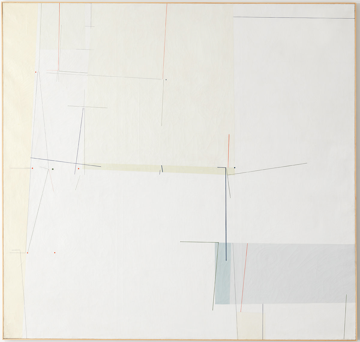
Development of 14 Themes (1951-52) - Tomas Maldonado
What I liked most about this piece were the hidden textures beneath the wash of white paint. Without seeing the painting up close, it's impossible to detect that there are slight ridges similar to that of cracked wooden veneer.

Yesterday I visited 'Radical Geometry' at the RA in order to make use of my Friends card. The exhibition consisted of artwork almost solely on lease from the Patricia Phelps de Cisneros Collection showcasing modern South American art. Whilst the show was, admittedly, disappointingly small, I found myself drawn to almost every piece- something I believe is quite a feat.

I drew a few direct observations of pieces I saw but feel that I was unable to accurately depict the pieces. A large amount of the work was 3D and I found that I was most interested in the sculptural pieces that held a form and a presence in the 4 rooms where everything was made of lines (as the word 'geometry' connotes). Furthermore, as photography was not allowed, it was incredibly hard to think about the exhibition as a whole once I'd left. It was only the sculptural pieces that left a lasting impression on me. 

Helio Oiticica's 'Red Monochrome' (1956) stood out to me as I immediately likened it to Yves Klein's blue monochromes. Coincidentally, another piece paid homage to Klein's work. 'Homage to Yves Klein' (1961) however was not my favourite piece of Jesus Soto's. Instead, it was a small installation of nylon wire suspended and held taut, painted to look as if it held rounded edges of a large cube.

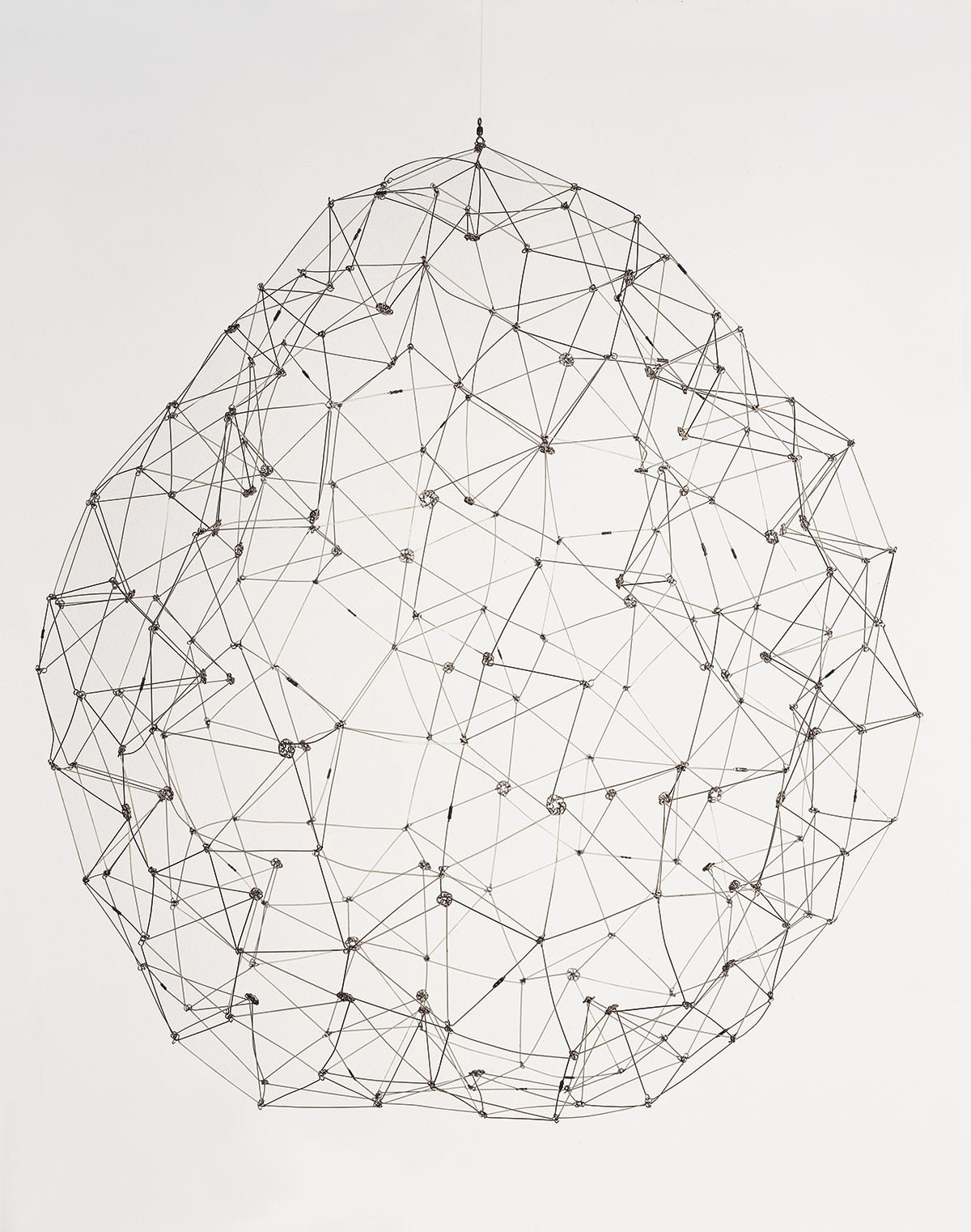
My favourite pieces in the exhibition however came from Gego whose work ranged from wire lattices to line drawings. Her hanging wire pieces had a serenity to it and the calmness was what I was most drawn to. It was a nice play on our conceptions of 'structure' to think about. A structure is usually considered to be a vast object in size or a piece of architecture that can hold itself. It usually connotes grandeur and I liked how I was carefully reminded that structures could be dainty whilst industrial at the same time.

Qsxioqxc9zopzin26mob
Sphere (1976) - Gego

From this exhibition, I've taken away a few ideas/concepts as well as some visual inspiration for the word 'structure'. The 3D forms that I liked most are examples of both- fragile but powerful at the same time. I'd like to look into and experiment with the idea of 'structure' being simultaneously robust and delicate. 


Monday, 1 September 2014

01/09/14 - 'Structural Attachment *in Mono'


We started by first looking at objects we resonate with the words 'structure' and 'attachment' in order to create our first responses to the title 'Structural Attachment *in Mono'. 
The objects I chose for 'structure' included: my Year 11 school timetable (for the structure of a day), a leaflet for the Sagrada Familia (Gaudi's unfinished church in Barcelona) and a photograph I took of a waterfall in the Norwegian Fjords (an example of a natural form). For 'attachment', I took a more conceptual approach which later proved to be quite difficult for me. My objects were: a photograph of myself and some friends (relating to psychological attachment and bonds made between people), a selection of mementos I collected over the summer whilst travelling (this was due to my personal attachment to places I visit and things I accumulate whilst there) and on a more literal meaning, 3 rings that interlock. Furthermore, these three rings are made of silver and I felt that this could further relate to Harlow (1958) and his study into attachment in babies.

When asked to draw our objects, I found this hard as my objects related to the title on a more conceptual level. However, I decided I would approach the task with an open mind, choosing to draw the rings freely, allowing the hardness of the metal to become soft and almost sloppy. Whilst drawing, I realised I was relating this style to that of my very good friend, Lisa. Her style of drawing was emulated in the way I drew and in this sense, I began incorporating the idea of attachments and relationships between people into what I was doing. Without being able to physically draw the relationship I have between my friends, I believe I was successful in putting down the other, more conceptual approach on paper.


After drawing my objects, I then moved on to look at my surroundings, wandering around the building and recording any images of 'structure' and 'attachment' I came across. In my observation drawings, I looked to essentially capture the things I am interested in- texture, tone and working in the style of the friend I am attached to. It was uncomfortable working at a large scale as I'm used to drawing observations in A5 but whilst I am not 100% happy with the work I produced, I know that what I have recorded is what I saw and felt interested in at the time. The majority of the drawings I produced were done in pencil, one of my favourite mediums and as I prefer to work grayscale, I did not use colour. I'm glad that my preference coincides with the project title but I want to carry on exploring different monochromes. 

Furthermore, I want to carry on researching and drawing inspiration from artists and things around me. At the present moment in time, I am most interested in psychological attachments and not physical attachments. I want to look into the bonds between people as it's highly relatable. My closest friends are moving away to head off to different universities across the country and whilst it's all very exciting and new, the feeling of not wanting to let go is still present. This is the 'attachment' aspect I am most interested in.