Showing posts with label review. Show all posts

Monday, 1 December 2014

01/12/14 - GUY BOURDIN PROJ. (Exhibition Review + Chosen Image)

Charles Jourdan Spring 1978 - Guy Bourdin 
In order to fully understand Bourdin's work, we went to the exhibition at Somerset House which showed a collection of photographs and films as well as a number of technical drawings and Polaroids that were used in his image-making process. When going around the exhibition, I noticed some common themes within Bourdin's work and whilst I was captivated by a number of his images, a small number of them were also disturbing and uncomfortable, which in itself is not a bad thing.

With a glamorous and sometimes objectifying portrayal of women, Bourdin's work seemed at times a little too risqué, bordering erotic. Whilst I usually wouldn't have a problem with that (especially given the era these photographs were taken in), there was still something uncomfortable about a few of the photographs. 

Aside from that, his images spoke to me mostly for their somewhat abstract and simple nature. As an avid lover of simplicity in everything from the way I dress to the way I lay out my sketchbook, I was drawn to the composition of the photographs and choosing a favourite to use as inspiration for an editorial proved to be a difficult decision. Bourdin's images are often either in black and white or heavily saturated in colour and whilst I liked the use of brights to highlight the product he was endorsing, the high saturation of colour is something that, as a creative myself, I tend not to replicate.


My final chosen image is from the Spring 1978 campaign for Charles Jourdan. The feelings I've gathered from the photograph tie in well for a SS15 editorial and on top of that, I didn't want to produce anything dark in colour similar to my last project. By choosing this photo, I'm able to return to my roots and have fun with my favourite colour palette too- blue.  


Tuesday, 21 October 2014

Anselm Kiefer with AttRAct at The RA

AttRAct Anselm Kiefer workshop - Caroline Wong
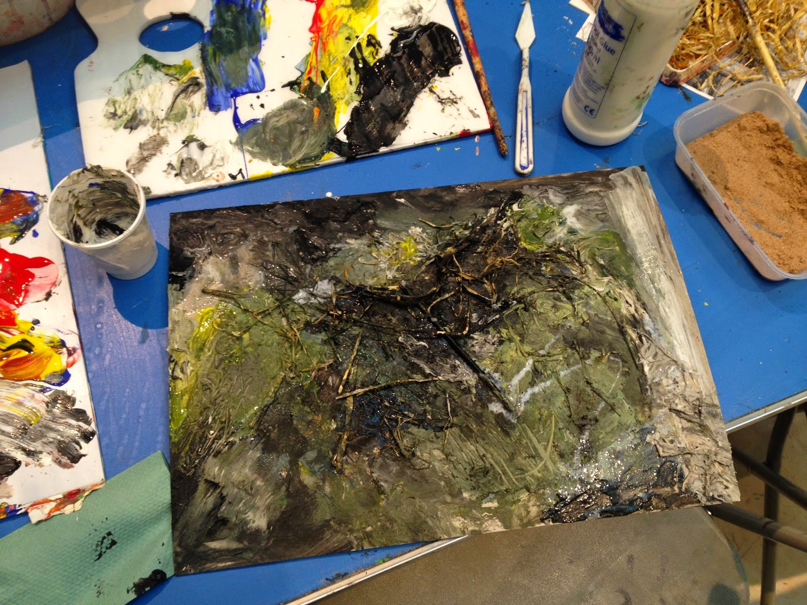
Anselm Kiefer inspired painting - Caroline Wong
Today I attended an AttRAct workshop on Anselm Kiefer at the Royal Academy of Arts. I was able to participate in the general discussion about the artwork prior to entering the exhibition and then went on to present my favourite piece post viewing. After this, I was encouraged to create a Kiefer inspired painting using numerous different painting mediums.


Kiefer's early work is my favourite. A lot of it is political and his paintings often reference Norse mythology and religion. As he was 'born in the rubble' of World War 2, a lot of his artwork looks into Germany prior to Nazi power and was often seen as scandalous. It wasn't until he moved to France that he began to garner interest in his work. In Germany, his work talked about the many taboos that had really only become taboos because of their association with Hitler. One famous example is that of a battle the Germans won against the Romans. Hitler however used this example of Germany beating a powerful army in his speeches and when Nazi power collapsed, referencing the Roman battle became something no one could do. Kiefer looks into returning power to Germany by looking past their Nazi period and revelling in their other successes. However, his approach can come across as a little 'in your face' and I guess it is because of this misunderstanding that his work never took off in his home country. There's a lot of imagery used in Kiefer's work and spending an hour in the exhibit was not nearly enough time to really get a look at the paintings. Each painting appeared to have more to it that it seemed. A lot of them told stories, or illicit curiosity. 

The workshop resulted in creating a Kiefer inspired painting where we used numerous mediums ranging from paint to PVA to sand and dirt. It felt nice to let loose and experiment as we were given the choice on whether or not to reference a selection of photographs. I chose not to, and am glad I didn't. The resulting piece I created is the creation of my own emotions at the time- light greens for a brightness, dark greens for the longing to go to the countryside and black and grey for an inner turmoil.


Saturday, 11 October 2014

11/10/14 - 'Dalston Anatomy' by Lorenzo Vitturi

Hairy orange, yellow balloons and rotten camote #2 - Lorenzo Vitturi 

Before my shift helping out and working at the Royal Academy of Arts, I took the time to hang around The Photographer's Gallery and see the exhibitions up. I first saw 'Dalston Anatomy', a series of photographs of structures Vitturi created made from things he'd found at Dalston's Ridley Road Market back when the exhibition first opened. After seeing it on the contextual studies sheet, I decided to revisit to refresh my memory.

I've always been interested in concepts such as this. My favourite kind of art is art with meaning, as ridiculous and pretentious as it sounds. Art that can illicit questions are my favourite. What's more enjoyable than having an internal debate over something in front of you? There's no right or wrong, only your opinion and what you yourself take away from the image in front of you. 

Dalston Anatomy, for me, combines the idea of ephemeral objects that will soon disappear or decay with the vibrancy of a market that can often be missed. Through the use of the found materials, Vitturi was able to create new sculptures that were often either left to rot or had pigment thrown at it. The ones with pigment are the most interesting to me. Whilst the pigment sometimes only accentuates the objects, often it also changes the subject of the photograph, morphing it into something else or obscuring it completely. My favorite photograph was of what I believe is a some sort of animal organ that has been covered in a lush green pigment. The object used is now completely changed. It's no longer a sort sight for eyes. Instead, it's transformed into something beautiful and pleasing to look at. 

What's more is that I can see the vibrancy of the colors acting as a means of preserving these ephemeral objects. As a lot of the sculptures photographed are either decaying matter or foods that will decay soon after being photographed, there is a real emphasis in my mind on the purpose of the pigment other than to create striking images. The use of pigments and other means to conceal the faces on portraits could also mean many things. On one hand, I thought it could be talking about the fact that without the color or concealment, many shoppers at the market would look and interact with the market stall sellers but never really remember them nor care even. Covering the identities of those sellers creates an air of curiosity- and people start to wonder who they are and what they're like. On the other hand however, the pigment could have simply been used to protect the identities of those Vitturi photographed.

I won't review the exhibition as a whole as I will probably mention my thoughts and opinions on the show in my contextual studies essay but Dalston Anatomy was an interesting exhibition to go to. The questions I had when I first visited were still there the second time I went and on my most recent visit, I actually found that I had a few ideas and answers to my initial questions. 


Sunday, 21 September 2014

16/09/14 - London Fashion Week (LFW write up)

Street-style stand off, Sept. 2014
 Our trip to London Fashion Week was fun, exciting albeit slightly disappointing. With the hopes of capturing some really great street style, we arrived to a quieter Somerset House than expected. As it were, it appeared that we, the students, were probably the only ones worth photographing at the beginning but as the day wore on, more people appeared dressed to the nines.

At one point, we were filmed by ITV talking with disabled model Chelsea Jay about the use of disabled models in the fashion industry and the lack of representation there was for her and others like herself. Whilst everything that was said and discussed in the interview made me stop and think (to the point where I just didn't have anything to say on camera, I was too engrossed in my own thoughts), one thing Chelsea said has stuck. She mentioned that what she and other disabled models are in is a vicious cycle. Brands state they would hire disabled models were they available. They wonder where they can find such models when agencies refuse to represent them. The agencies on the other hand argue that because disabled models don't find work, it would be pointless to sign and represent any of them. It was this back and forth name blame game that really got me thinking.

---

I headed to Dover Street Market another day as I wanted to go with a clear head at a time where I wasn't thinking so much about the people I'd seen at LFW. I've been to Dover Street Market numerous times as it's home to some great designers. What's more is that I love how it's a hub for the craziest designs imaginable. I still remember the time where I found Comme Des Garcons' AW12 collection there and couldn't quite bring my head around the overgrown felt 2D shapes in front of me, hanging up on hangers because they were... garments of clothing? The whole thing seemed bizarre to me at the time. 

My favourite thing about Dover Street Market however has got to be the people that frequent the store. Whilst not everyone is there to purchase something, I find that those that visit are often as interestingly dressed as those that can buy the clothing the store sells and more often than once have I fallen in love with something on a customer rather than on a mannequin. For me, Dover Street Market is a small, creative atmosphere where the clothing isn't just an inspiration but also the people.


Wednesday, 3 September 2014

Saatchi Gallery Review (50 words)

Children of Jesus (The Zionist series)
Children of Jesus (The Zionist Series) (2010) - Mario Macilau


The Saatchi Gallery is a personal favourite among the art galleries I frequent and unsurprisingly, 'PANGAEA' was definitely worth seeing. To me, the exhibition was more than just giant ants scaling walls of a gallery. It was thought-provoking and I left asking myself questions about my thoughts on society today.